![](https://thepopp.com/wp-content/uploads/2015/06/Rigel.jpg)
![](http://thepopp.com/wp-content/uploads/2015/06/Rigel1-150x150.jpg)
![](http://thepopp.com/wp-content/uploads/2015/10/Slide-120-150x150.jpg)
![](http://thepopp.com/wp-content/uploads/2015/10/Slide-218-150x150.jpg)
![](http://thepopp.com/wp-content/uploads/2015/10/Slide-316-150x150.jpg)
![](http://thepopp.com/wp-content/uploads/2015/10/Slide-410-150x150.jpg)
![](http://thepopp.com/wp-content/uploads/2015/10/Slide-510-150x150.jpg)
![](http://thepopp.com/wp-content/uploads/2015/10/Slide-610-150x150.jpg)
![](http://thepopp.com/wp-content/uploads/2015/10/Slide-710-150x150.jpg)
![](http://thepopp.com/wp-content/uploads/2015/10/Slide-810-150x150.jpg)
![](http://thepopp.com/wp-content/uploads/2015/10/Slide-910-150x150.jpg)
![](http://thepopp.com/wp-content/uploads/2015/10/Slide-1010-150x150.jpg)
![](http://thepopp.com/wp-content/uploads/2015/10/Slide-1112-150x150.jpg)
![](http://thepopp.com/wp-content/uploads/2015/10/Slide-127-150x150.jpg)
![](http://thepopp.com/wp-content/uploads/2015/10/Slide-137-150x150.jpg)
![](http://thepopp.com/wp-content/uploads/2015/10/Slide-147-150x150.jpg)
![](http://thepopp.com/wp-content/uploads/2015/10/Slide-157-150x150.jpg)
![](http://thepopp.com/wp-content/uploads/2015/10/Slide-167-150x150.jpg)
![](http://thepopp.com/wp-content/uploads/2015/10/Slide-177-150x150.jpg)
![](http://thepopp.com/wp-content/uploads/2015/10/Slide-186-150x150.jpg)
![](http://thepopp.com/wp-content/uploads/2015/10/Slide-196-150x150.jpg)
![](http://thepopp.com/wp-content/uploads/2015/10/Slide-206-150x150.jpg)
![](http://thepopp.com/wp-content/uploads/2015/10/Slide-219-150x150.jpg)
![](http://thepopp.com/wp-content/uploads/2015/10/Slide-226-150x150.jpg)
![](http://thepopp.com/wp-content/uploads/2015/10/Slide-235-150x150.jpg)
![](http://thepopp.com/wp-content/uploads/2015/10/Slide-244-150x150.jpg)
![](http://thepopp.com/wp-content/uploads/2015/10/Slide-254-150x150.jpg)
![](http://thepopp.com/wp-content/uploads/2015/10/Slide-264-150x150.jpg)
![](http://thepopp.com/wp-content/uploads/2015/10/Slide-274-150x150.jpg)
![](http://thepopp.com/wp-content/uploads/2015/10/Slide-284-150x150.jpg)
![](http://thepopp.com/wp-content/uploads/2015/10/Slide-294-150x150.jpg)
![](http://thepopp.com/wp-content/uploads/2015/10/Slide-304-150x150.jpg)
![](http://thepopp.com/wp-content/uploads/2015/10/Slide-317-150x150.jpg)
![](http://thepopp.com/wp-content/uploads/2015/10/Slide-325-150x150.jpg)
![](http://thepopp.com/wp-content/uploads/2015/10/Slide-335-150x150.jpg)
![](http://thepopp.com/wp-content/uploads/2015/10/Slide-344-150x150.jpg)
![](http://thepopp.com/wp-content/uploads/2015/10/Slide-354-150x150.jpg)
![](http://thepopp.com/wp-content/uploads/2015/10/Slide-373-150x150.jpg)
![](http://thepopp.com/wp-content/uploads/2015/10/Slide-363-150x150.jpg)
![](http://thepopp.com/wp-content/uploads/2015/10/Slide-383-150x150.jpg)
![](http://thepopp.com/wp-content/uploads/2015/10/Slide-392-150x150.jpg)
![](http://thepopp.com/wp-content/uploads/2015/10/Slide-402-150x150.jpg)
![](http://thepopp.com/wp-content/uploads/2015/10/Slide-413-150x150.jpg)
![](http://thepopp.com/wp-content/uploads/2015/10/Slide-423-150x150.jpg)
![](http://thepopp.com/wp-content/uploads/2015/10/Slide-433-150x150.jpg)
![](http://thepopp.com/wp-content/uploads/2015/10/Slide-443-150x150.jpg)
![](http://thepopp.com/wp-content/uploads/2015/10/Slide-452-150x150.jpg)
![](http://thepopp.com/wp-content/uploads/2015/10/Slide-462-150x150.jpg)
![](http://thepopp.com/wp-content/uploads/2015/10/Slide-482-150x150.jpg)
![](http://thepopp.com/wp-content/uploads/2015/10/Slide-472-150x150.jpg)
![](http://thepopp.com/wp-content/uploads/2015/10/Slide-492-150x150.jpg)
![](http://thepopp.com/wp-content/uploads/2015/10/Slide-501-150x150.jpg)
![](http://thepopp.com/wp-content/uploads/2015/10/Slide-512-150x150.jpg)
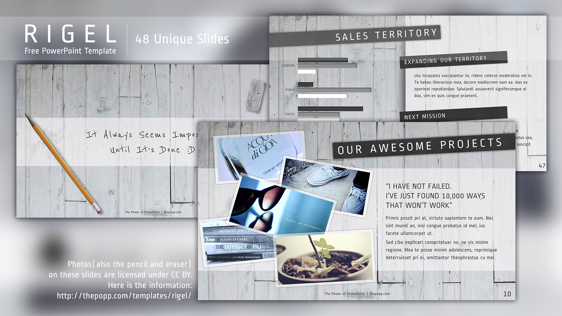
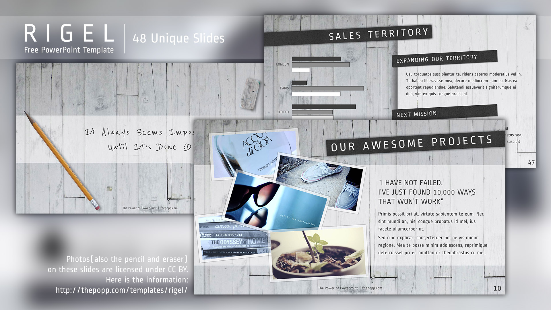
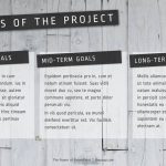
前回がFlatなデザインでかなりシンプルに落ち着いていたので、今回は少しデザインの比率を高くし、ぱっと見の印象を強くしました。
反面、文章の見易さを多少犠牲にしていますので、場面によっては字が読みにくく感じる箇所もあるかもしれません。見た目重視のテンプレート、Rigel(リゲル)です。
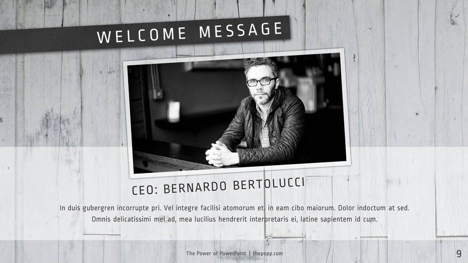
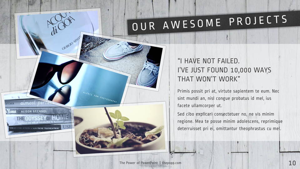
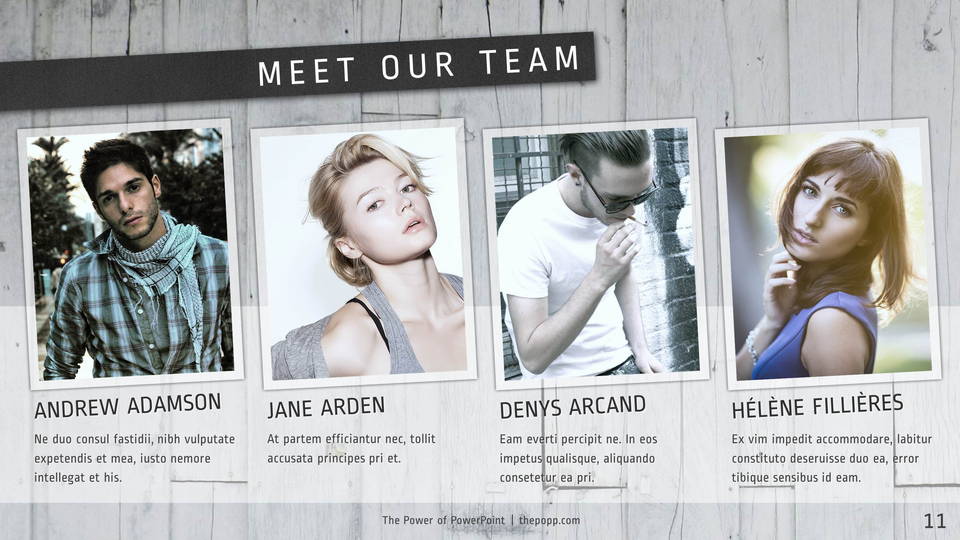
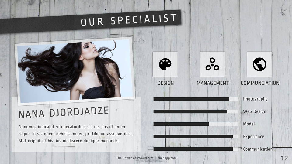
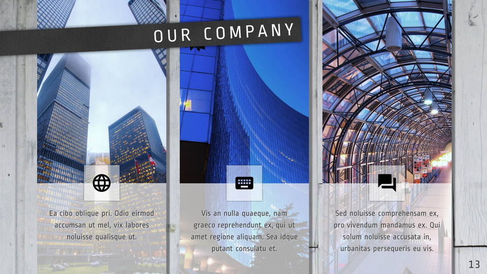
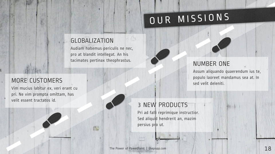
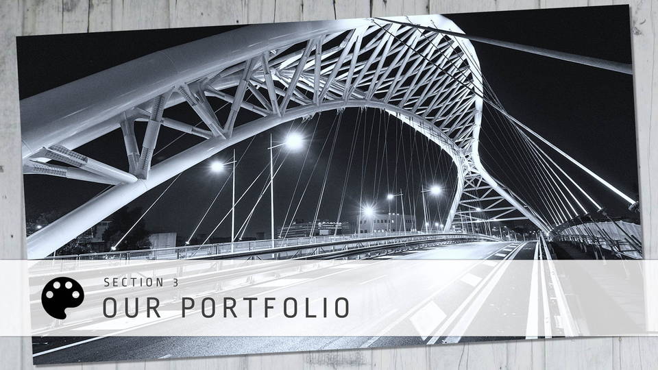
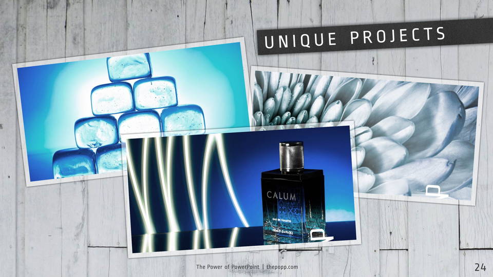
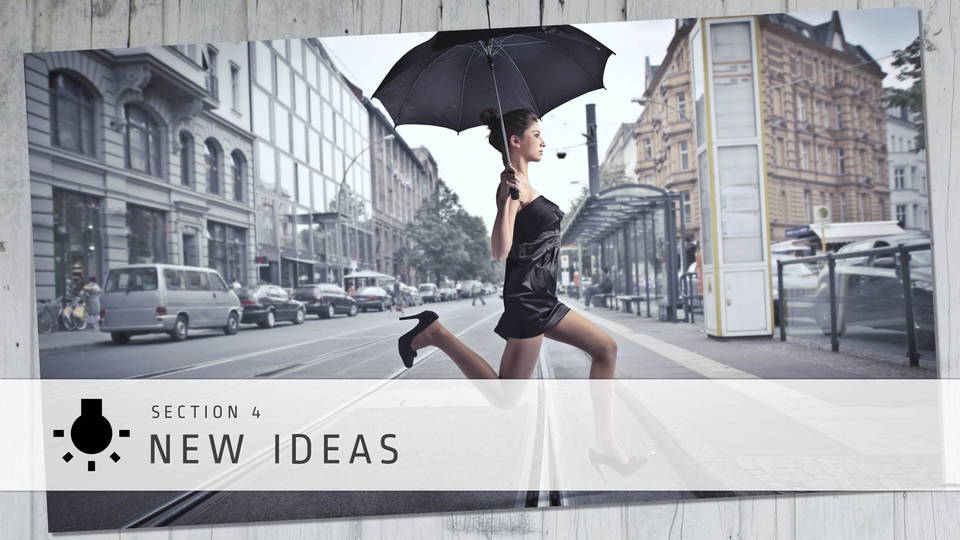
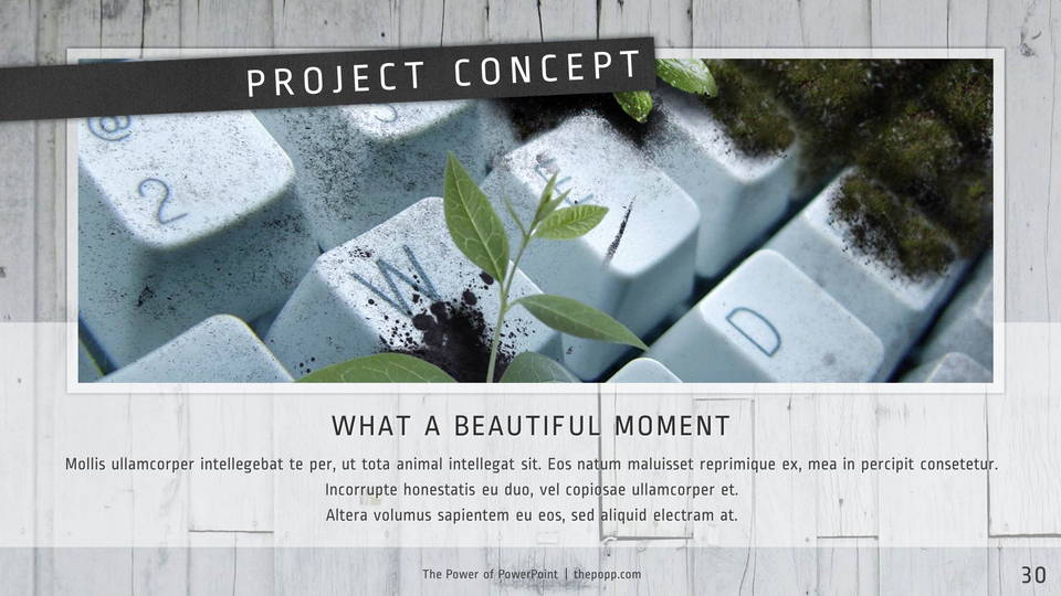
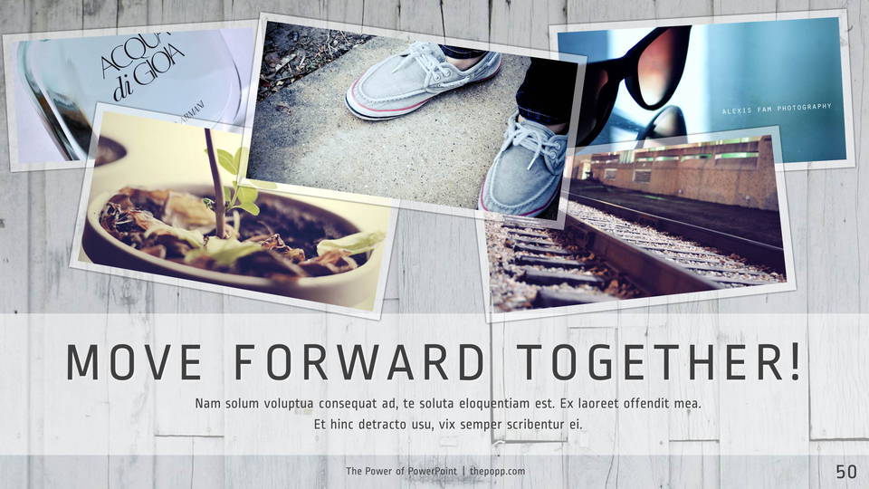
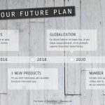
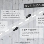
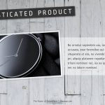
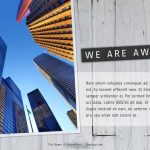
黒と白以外、一切色を使っていません。つまりメインカラーもアクセントカラーもありません。背景に白い木の素材を採用したので、白黒のモノトーンでまとめてみました。物足りない人は、好きな色をアクセントとして足してもらってかまいません。ベースが白黒なので、たいていの色は違和感なく溶け込めると思います。
フォントについて
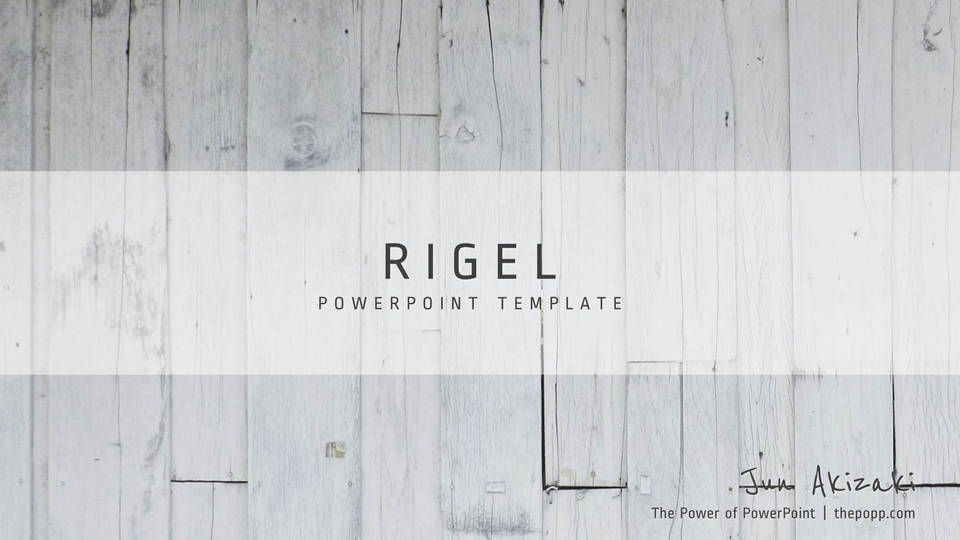
フォントはRopa Sansという新しいフォントを採用しました。
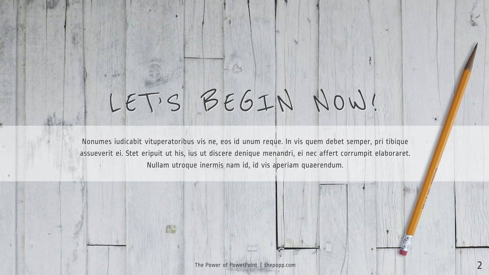
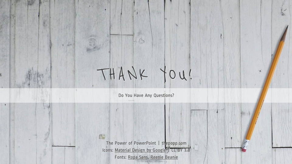
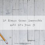
また、数箇所でてくる手書き風のフォントは、Reenie Beanieといいます。このサイトでも採用しているフォントで、読みやすくはありませんが、部分的に使うとなんとも言えない味を出してくれます。
![RigelSlide (49)](http://thepopp.com/wp-content/uploads/2015/06/RigelSlide-491.jpg)
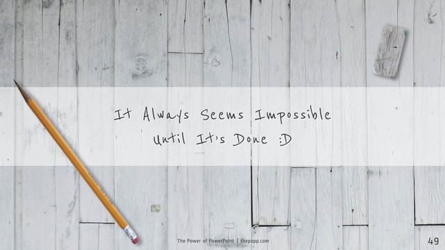
ちなみに鉛筆はこのフォントからインスパイアされて追加しました。自分で言うのもなんですが、いい感じじゃないですかね!? 笑
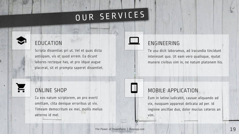
アイコンについて
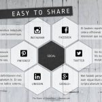
今回アイコンは同梱していません。好きなアイコンをWebで探して、アイコン用のプレースホルダーに入れて使ってください。サンプルで用いたのはgoogleが作成したMaterial DesignというFont Packageです。
なお、僕がパワーポイント用に変換したMaterial Iconを下のページで公開しています。
カラーバリエーション
このテーマにはカラーバリエーションはありません。なんたって白黒ですからね!
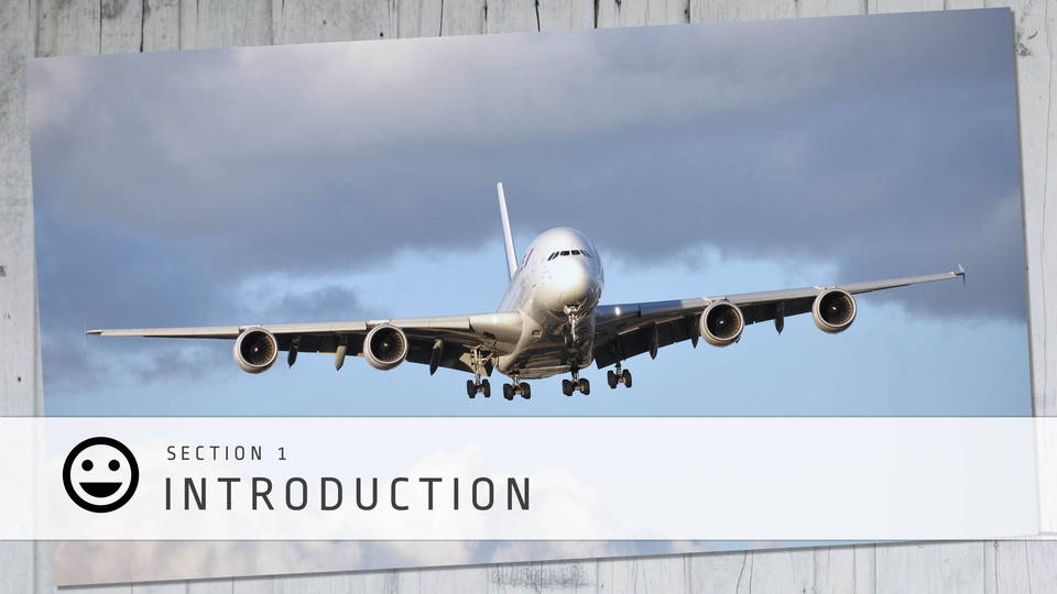
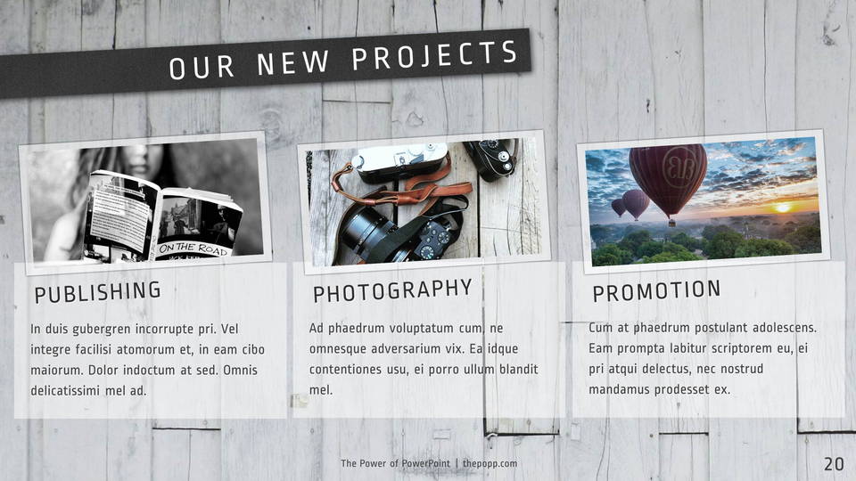
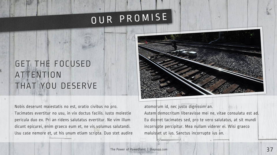
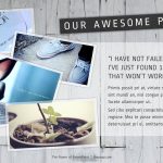
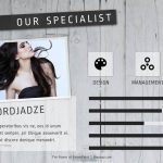
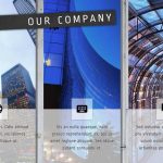
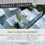
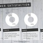
画像を挿入する際は、温度を落として青色に寄せるときれいに見えると思います。サンプルはすべて色の温度を落としています。
使用した画像のライセンスについて
動画とサンプルに使用した画像のほとんどは、CC BYライセンスが適用されています。PowerPointのプレースホルダを利用してCropしたり、色合いを変更する処理を行っているものがあります。鉛筆と消しゴムについては、Photoshopで切り抜きました。